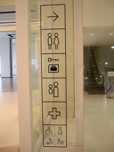
Researching into existing gallery wayfinding
I decided it would probably help me settle on an approach for the publication and wayfinding if I researched into the aesthetics of existing gallery wayfinding more:
These are all perfect examples of how wayfinding and information can be added to the walls of an exhibition space so that it almost seems to become part of the exhibition. All of these examples seem to merge seamlessly into the space in which they have been applied, and they all appear so sleek within the surroundings. They're good inspiration for the aesthetics of my wayfinding, yet I want mine to stand out a bit more, while still taking on board the idea of it blending into the background.
UPDATE
I found a few more images which relate to the wayfinding design of museums and art galleries that are relevant to the style of what I want to produce yet these and all a bit bolder and more colourful than the examples I had found before.
These examples all have a bit more of a presence within the space yet that doesn't seem to detract from the design of any of them. The way in which the visitor interacts with them is still pretty much the same but they seem to be named at different audiences.


