Developing the initial layout designs
Putting the logo into the colour scheme:
Testing different front cover ideas:
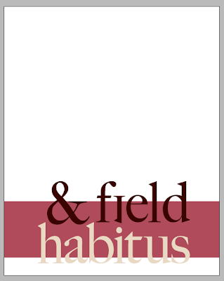
After trying these different layouts, I decided it should be even more inconspicuous by having a simple plain background with the logo, a line of text and a band of the beige colour from the colour scheme.
The typefaces I have chosen to use throughout the publication are Gill Sans Regular for the body copy and Quaver Serif (from Lost Type website) for the headers and quotes.
Quaver Serif:


