Archive for April 2013

Context of Practice - Publication - Developing Logo Ides

Continuing with the logo developments

I decided that even though I am still struggling with the content and tone of voice, it would probably help me to keep developing the visuals so I have gone back to the logo development.


I first tried a couple of different layouts of the logo but after two attempts decided it didn't look right and didn't quite fit the aesthetics I was looking for. 


I noticed that if I lined the two words up I could play with the idea of the two i's lining up and see if I could connect them in some way to show the relationship between the field and the habitus as being interlinking. 


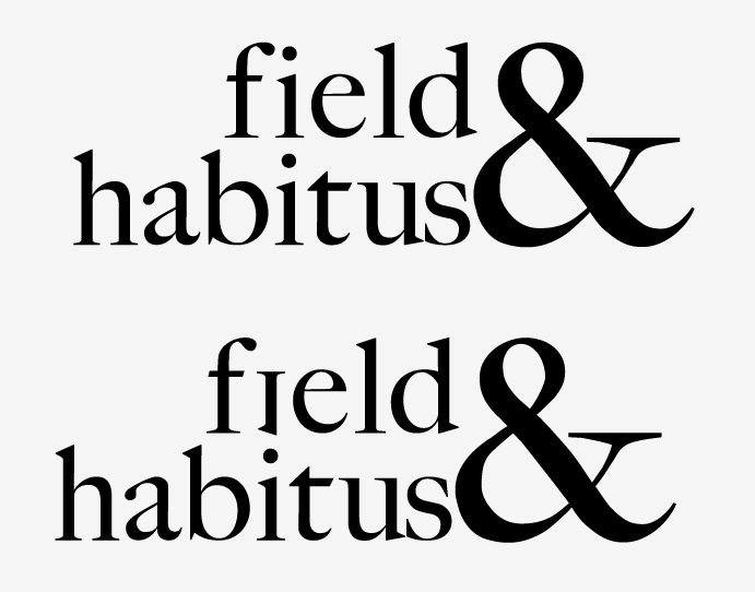
I inverted the i in the word field so that the dot would line the two letters up together:


 I then also decided I didn't quite like the way the ampersand was positioned so then moved it so that it lined up with the space between the ascenders of the h and b of habitus:


I think this one seems to work loads better than the previous ones so I'm now going to look into colour schemes to apply to the booklet and wayfinding.


UPDATE

I decided to tighten the kerning of the letters on the logo to further show how field and habitus are interrelated so I pushed the logo further into this:


A couple of people in the studio then pointed out to me that the ampersand looked a bit strange stretched to fit the gap, so after playing with it a bit more, I settled on this which I'm actually really pleased with:


Monday 29 April 2013 by Andrea Hannah Cooper
Categories: , , | Leave a comment

Context of Practice - Publication Crit Feedback

Crit feedback 

For the crit today, I took the same presentation boards as I did for the last one and the logo developments although I didn't end up showing them as the crit was with different people than the last time so it was a chance to get a different outlook and different opinions on the concepts. 

This is the feedback I brought back from the session: 


I was disappointed that there wasn't much more that anyone said other than that it was an interesting topic to work with and that I would have to be careful not to offend people. Fred suggested taking it down a much more fun and light hearted route than I had been thinking of which has now left me more confused than I was before the crit as to where to go with it. 

I could change the concept to be more like '10 things to do in an art gallery' as a bit of a joke, but I really don't know how I would bring the theoretical research into that. 

Monday 15 April 2013 by Andrea Hannah Cooper
Categories: , , | Leave a comment

Context of Practice - Publication Name & Logo Development

Naming the publication and beginning logo ideas


I still need to work out the message but I have decided that as it is based on the theory of 'field and habitus' that the theory name would make quite a fitting name for the booklet/project.

I decided to start putting some visuals together in the hope that that would inspire me with the content/concept and I began by experimenting with putting together the words 'field & habitus' in different typefaces and layouts to form a logo.


I have decided the last logo development is the one which I am going to go with for now using the typeface 'Big Caslon Medium'. 

I have also looked into the format for the exhibition booklet:

 
and mocked up a quick example of the logo on the front cover to show the kind of visual style I want to go with in the crit tomorrow:


Sunday 14 April 2013 by Andrea Hannah Cooper
Categories: , , | Leave a comment

Responsive - Lego - General Research

Research into Lego Playgrounds


Ugandan Flag:


Wednesday 10 April 2013 by Andrea Hannah Cooper
Categories: , , | Leave a comment

Responsive - Kleenex - Trend Forecasts Research


Trend forecasts from Talenthouse website 


Kelly Hoppen MBE

With 37 years experience at the forefront of the design world, Kelly Hoppen MBE is one of the most celebrated British designers in the industry. Kelly’s ever-evolving style is underpinned by a subtly coordinated fusion of East meets West; clean lines and neutral tones.

Kelly puts her stamp on the homes, yachts and jets of private clients, as well as select commercial projects all over the world and is the author of seven design books to date. Devoted to making her design ethos accessible to the masses, and keen to champion design talent, Kelly also shares her extensive knowledge in her popular Kelly Hoppen Design School.

Kelly says:
"The design trends forecast for the home this year are all about texture and colour.

When designing something as functional as a tissue box it needs to work in two ways, both as a functional product and also as an item that sits quietly next to a bed, on a side table, on a dressing table or essentially anywhere within your home. It is an object that needs to blend into your home but is stylish at the same time.

Ikat design will also be massive this year, think bold designs which are incredibly textural. The beauty of Ikat is that it gives sharp spurts of colour to a neutral base. It gives a space a sense of identity and character but can be personalised to your taste. The colour palette is very neutral with burst of deep hues; taupe; white; cream; greys; mouse; mocha with splashes of charcoal and royal purples; reds and burnt oranges.

Shiny surfaces; lacquers; marbled effects; lace and chain mail are also going to be huge looks but used by layering over neutral colours; think of how amazing a cushion would look in wonderful linen with lace or chain mail or gauze or filigree cut outs.

Cubism is also a fantastic way to break up spaces either via movable walls and screens or the simple and layering of colours and textures, think Mondrian art.”

Research into upcoming trends

Ikat Patterns (http://en.wikipedia.org/wiki/Ikat)

Ikat, or Ikkat, is a dyeing technique used to pattern textiles that employs a resist dyeing process similar to tie-dye on either the warp or weft fibres prior to dyeing. The word ikat derives from the Indonesian word mengikat 'to tie'.


Saturday 6 April 2013 by Andrea Hannah Cooper
Categories: , , | Leave a comment

Responsive - Kleenex - Existing Packaging

Existing Kleenex cube packaging as inspiration


Kleenex have used different styles of decorating their tissue boxes, such as photography, illustrations, patterns and abstract shapes. Each design they have used is fairly eye catching and will stand out on a supermarket shelf from the other tissue boxes. As there is a fairly wide range of different box designs (and these are just for their cube collections) there is a choice available for people who want to match their tissue box to the interior design of their home. 


by Andrea Hannah Cooper
Categories: , , | Leave a comment

Context of Practice - Publication Development

Developing ideas for the publication formats and designs

Although I'm still struggling slightly with the concept of the publication as I'm unsure of the exact message I'm trying to put across, I have planned out all the other aspects of the products as best as I can:


Monday 1 April 2013 by Andrea Hannah Cooper
Categories: , , | Leave a comment