Finding and editing images for the publication
These are some of the images I have found online to include in the booklet:


and these are examples of some of them duotoned using the light red colour from the colour scheme and black so that it keeps the colours of the booklet consistent throughout:


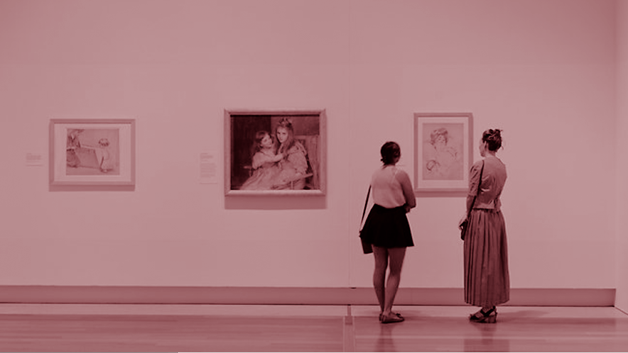
I think the duotoned images almost certainly add a sense of mystery to each image, and with the way they are now toned red, it is almost going against the social norms of behaviour within the art gallery where the walls are usually always white. It feels like they fit the rebellious side of the content of the booklet while still fitting in with the other design elements.