Creating the inDesign document
- using the thumbnails I drew out to divide up the text in the publication
- using the typeface Gill Sans as I felt it had a rather "official" feel to it and works well as a whole font family in this type of publication
- I have tried to keep the layouts of text simple and eye catching, and as the purpose is to break down the information and make it easier to understand/more accessible for students, I wanted the layouts to be fun and not text heavy. A book that would appeal more to students is one which is more illustrative and brightly coloured, without block after block of text.
- Next, I am going to add the illustrations/images where necessary, and then add some colour into the layouts to make it look less like a "boring textbook" and more visually interesting.
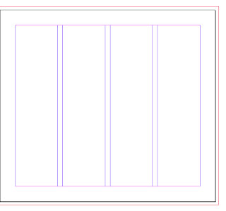
Using a simple 4 column grid:
- rough layouts of the text based on the thumbnail designs, ready for imagery and formatting to be added:


