Lecture Notes from the A History of Type Lecture - 11/01/12
A History Of Type
- simple introduction to the history of typography
- 6 main classifications of type
- notable typefaces
- metalinguistic function of typography
- kerning and x-heights
Aims of the lecture:
- example of using different typography styles to change meaning:
- writing & typography = overlap between visual and verbal communication
Typography =
- meta-communication: language that comments on/ frames another language
- paralinguistics: structures/ rhythm of communication
- kinesics: adding gestures to words
6 Main Classifications of Typography
Late age of print
- 1450 - beginning of the "age of print"
- Term comes from media theorist Marshall McLuhan
- Gutenberg printing press
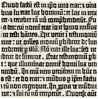
Gutenberg Gothic script - 1450:
- all forms of capital letters in English comes from Roman script
- all forms of lower case letters in English come from Medieval handwriting
Humanist Typefaces
- blackletter
- Gothic
- Nicolas Jensen - Jensen typeface - 1475:
- typeface made for legibility
Characteristics:
- similar strokes + upper incline on the 'e'
Geofroy Tory
- alphabet should reflect the ideal human form
Modern versions:
- Centaur - Bruce Rogers:
- Kennerly - Mitchell Kennerly 1911:
- Jersey - Gustav Jaeger 1985:
Old Style (Venetian)
- first italics
- horizontal cross stroke of the 'e'
- where typography starts as an art
- created on quasi-scientific lines
Modern versions:
- Palatino:
- Garamond:
- Perpetua:
- Goudy old style:
Transitional fonts
- William Caslon - declaration of independence
- Baskerville
Modern/ Didone Typefaces
- high contrast
- represent quality
- Attributed to Firmin Didot, 1784 but the most influential ‘Didone’ typeface was created by Giambattista Bodoni
Slab serif/ Egyptian
- 1800s
- attention seeking
- useable in reproduction
Sans Serif typefaces
- around in 1800s
- became popularised in modernist times
- form following function
- Example of Herbert Bayer’s sans- serif typeface- Bayer, 1925
- A unicameral type - all text to be lower case, (to ditch capitals)
Examples:
- Gill Sans
- Akzidenz Grotesk
- regression on the modern approach
- Times New Roman Font - Stanley Morison - 1932:
- Cooper Black - Oswald Bruce Cooper - 1921:
Helvetica
- Swiss style
- 1957 by Max Miedinger
- 'font of corporate capitalism'?
Differences between Helvetica and Arial:
New Generation of Typography
1994 - Rudy Vanderlans argues ‘there is a new generation of graphic designers who, before ever considering what their favourite typeface is, will design a new one’
Jonathan Barnbrook - 1990
Conclusion:
Notes:


