5 Graphic Designers Related to Modernism
Max Miedinger
- Switzerland - 1910-1980
- Switzerland - 1910-1980
- Typographer credited with designing the typeface 'Helvetica', which was previously called 'Neue Haas Grotesk'.
- http://maxmiedinger.com/
-'Max Miedinger worked as a graphic designer and typographer for most of his life. His clean typeface version of the Akzidenz Grotesk typeface, Helvetica, furthered the Swiss design movement towards simplicity eventually taking over the world of typography for the fifty years after its creation. His contribution to the typographic field by creating the typefacesHelvetica, Miedinger, Swiss 921, Monospace 821, and Swiss 721 adds his name to the short list of famous typographers over the last five hundred years.'
http://maxmiedinger.com/bio.html

- companies that use Helvetica for their logo:

http://maxmiedinger.com/max-work.html
- http://www.helveticafilm.com/index.html
Massimo Vignelli
- Milan - 1931- present day
- Vignelli works within the Modernist style, using simplicity and basic geometric forms within his work.
- http://www.vignelli.com/
- "Massimo Vignelli, born in Milan, studied architecture in Milan and Venice. He came to the United States from 1957 to 1960 on fellowships from Towle Silversmiths in Massachusetts and the Institute of Design, Illinois Institute of Technology, Chicago. In 1960, with Lella Vignelli, he established the Vignelli Office of Design and Architecture in Milan.
In 1965, Vignelli became co-founder and design director of Unimark International Corporation. With Lella Vignelli, he established the offices of Vignelli Associates in 1971, and Vignelli Designs in 1978. His work includes graphic and corporate identity programs, publication designs, architectural graphics, and exhibition, interior, furniture, and consumer product designs for many leading American and European companies and institutions. Vignelli has had his work published and exhibited throughout the world and entered in the permanent collections of several museums, including the Museum of Modern Art, the Metropolitan Museum of Art, and the Brooklyn Museum. He is a past president of the Alliance Graphique Internationale (AGl) and the American Institute of Graphic Arts (AlGA), a vice president of the Architectural League, and a member of the Industrial Designers Society of America (IDSA). His many awards and honors include the AIGA Gold Medal, the Presidential Design Award, and the National Arts Club Gold Medal for Design."
http://bigthink.com/massimovignelli
 |
| http://www.vignelli.com/ |
 |
| http://www.stendigcalendar.com/Stendig_Calendar/Welcome.html |


http://www.designboom.com/eng/interview/vignelli.html
Josef Müller-Brockmann
- Switzerland - 1914-1996
- Switzerland - 1914-1996
- Müller-Brockmann used clean designs, following a grid system, and is noted for his clean use of type, shapes and colours.
- "Josef Müller-Brockmann was born in Rapperswil, Switzerland in 1914 and studied architecture, design and history of art at the University of Zurich and at the city’s Kunstgewerbeschule. He began his career as an apprentice to the designer and advertising consultant Walter Diggelman before, in 1936, establishing his own Zurich studio specialising in graphics, exhibition design and photography. By the 1950s he was established as the leading practitioner and theorist of Swiss Style, which sought a universal graphic expression through a grid-based design purged of extraneous illustration and subjective feeling. His “Musica viva” poster series for the Zurich Tonhalle drew on the language of Constructivism to create a visual correlative to the structural harmonies of the music. Müller-Brockmann was founder from and, from 1958 to 1965, co-editor of the trilingual journal Neue Grafik (New Graphic Designer) which spread the principles of Swiss Design internationally. He was professor of graphic design at the Kunstgewerbeschule, Zurich from 1957 to 1960, and guest lecturer at the University of Osaka from 1961 and the Hochschule fur Gestaltung, Ulm from 1963. From 1967 he was European design consultant for IBM. He is the author of The Graphic Artist and his Design Problems (1961), History of Visual Communication (1971), History of the Poster (with Shizuko Müller-Yoshikawa, 1971) and Grid to many symposiums and has held one-man exhibitions in Zurich, Bern, Hamburg, Munich, Stuttgart, Berlin, Paris, New York, Chicago, Tokyo, Osaka, Caracas and Zagreb. In 1987 he was awarded a gold medal for his cultural contribution by the State of Zurich."

http://www.eyemagazine.com/feature.php?id=51&fid=163


http://www.noupe.com/design/josef-muller-brockmann-principal-of-the-swiss-school.html
Wim Crouwel
- Willem Hendrik (Wim) Crouwel
- Willem Hendrik (Wim) Crouwel
- Netherlands - 1928 - present- One of the founders of Total Design studio, worked as a typographer and created the typeface New Alphabet. He is well known for his use of grid systems and typography that is rooted in the 'International Typographic style'.
- "Wim Crouwel, born in Groningen (the Netherlands) in 1928 is a remarkable and inspiring figure with an inventive spirit and vision, vigorous and always distinguished.*
He designed his first poster in 1952. After leaving artschool he became a painter leaning towards Expressionism, but as he designed this first poster he discovered the pleasure of organising visual information in an aesthetical context.
The contrast between Crouwel as a lyrical expressionist painter and objectivating functionalist designer couldn’t be more extreme. As a designer he felt related to the Bauhaus ideas, the swiss-inspired international style. He was fascinated by the rational aspect in Bauhaus typography, which he discovered through Karl Gerstner’s and Gerard Ifert’s work.
Although his ideas were bauhaus-related, unlike many Crouwel was not a dogmatist. He was fascinated by the ideas about serial and mass production, as he stated “we need the machine since we have no time”. But he also believed “the machine cannot replace the precision of the human eye and human feeling”.* Crouwel’s work has always consisted of these two essential elements: the emotional aspect and the rational one.
The task of the designer consists of analysing the design project and solve the problems he distilled in an objective way. The message and the way it should be presented flows out of this process. Graphic design is a wide field in which Crouwel mainly focussed on type. He works quite constructive, constructs type, and works on grids. Crouwel is especially admired for his systematic approach and his creative handling of the shape of letters. His work was influenced by the pre-war Werkmann and post-war Sandberg, an individualistic generation of typographers who dared to juggle with letters."
http://www.iconofgraphics.com/Wim-Crouwel/


http://www.creativereview.co.uk/cr-blog/2007/july/striking-the-eye-an-interview-with-wim-crouwel
 |
| http://www.guardian.co.uk/artanddesign/2011/apr/07/wim-crouwel-design-museum-typography |
Herbert Bayer
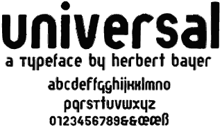
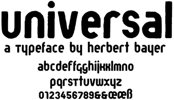
This sample of Bayer's universal typeface was set in Bayer Press, an in-house font developed by Victory Type based on Bayer's narrow face bold version of universal, designed in 1925. Presently, a geometrically perfect and historically accurate remake of universal is in development by Noah Rothschild.
- Austrian American - 1900 - 1985
- Bayer was widely recognised as the last living member of the Bauhaus, and is credited with designing an entirely lowercase san serif typeface used for most Bauhaus publications, and designed a universal typeface.
http://www.type.nu/bayer/univer.html
"If Herbert Bayer had produced nothing after the age of 28, his accomplishments to that point alone would make him one of the great pioneers in visual communication. "
http://www.adcglobal.org/archive/hof/1975/?id=281
 |
| Bayer designed the type used in the signage at the Bauhaus building in Dessau. http://www.designishistory.com/1920/herbert-bayer/ |


http://www.thenewgraphic.com/2011/05/herbert-bayer/