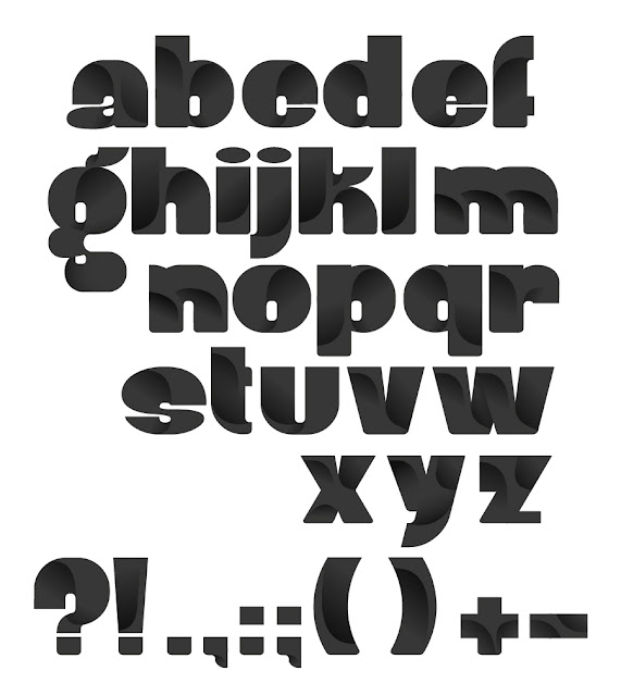
Another typeface I have found on the Behance Network that directly relates to the Alphabet Soup brief of stretching letterforms is one named "Robu Bold" in which the letters look as if they have been stretched in every direction. Many bold fonts appear in a similar style to this yet this one stands out to me because of the detailing inside each letterform, which makes it look more like each shape has been stretched or expanded in a uniform way.
Alphabet Soup
http://www.behance.net/gallery/Robu-Bold-Typeface/687732
The darker patches inside each letter make them look as if that is the actual shape of the letter yet they have been stretched outwards. This detailing emphasises the "change" in shape that these letters appear to have gone through.
Friday, 30 September 2011
by Andrea Hannah Cooper
Categories:
Alphabet Soup,
OUGD403,
Visual Thinking
|
Leave a comment
